Learn how to use color psychology in the workplace to improve your productivity and create a more pleasant working environment. Whether you’re at home or at work.
The psychology of color is something that is usually associated with design and art, but it’s also be used in other areas. It has an impact on architecture and interior design, marketing, and even our own personal well-being.
Color can affect our emotions, behavior, and even the way we think. It is one of the most powerful non-verbal forms of communication and it can be used to influence our moods and emotions.
What Is The Psychology Of Color?
The psychology of color is a branch of psychology that studies the effects that different colors might have on our emotions, our well-being, our decisions, and more.
It considers how colors in our environments or on specific elements can influence people and whether color can be used to change specific outcomes, for example, making a person more productive.
There are many different findings related to the psychology of color.

Colors with a long wavelength, like red, tend to feel arousing and warm, while colors with a shorter wavelength, like blue, tend to feel relaxing and cool.
Such perceptions are more universal, as they depend on the perception of different colors that are tie to their physical characteristics.
Wavelength affects most people in the same way – red favors attention, while blue allows for creativity.
People tend to have associations between different colors and specific situations, concepts, and more, but these links might be more tied to the cultural context.
For instance, black might be tied to concepts of mourning.
Some colors have strong biological associations.

Red usually signalizes aggression and dominance.
This is also true in humans – people who get angry tend to go red in the face, while those who are afraid get pale.
One of the bases of color psychology is physiological, with links that are based in biology.
Other associations with color are based more strongly on learning, that is, on how colors are paired culturally or in the environment.
For instance, some colors might gain a specific meaning due to repeated exposure and due to the context.
Red might signify danger in one context and attraction in another.
Colors also have meanings derived from language and usual expressions – “I am blue”, “I am seeing red”, and so on, which also influences the associations a person has between the color and a concept.
Culturally, there may be specific association – in many Western countries, people wear black to funerals, which gives it a grim context and links it to death.
This means that color psychology is complex and might depend on culture.
However, it is also true that many colors have a more general effect.
There has been a lot of research regarding the way colors might be used to improve workplace productivity and other measures.
Let’s take a look at how the psychology of color can be used in business settings.
Colors in the workplace.
When discussing the color selection for the workplace, we might want to focus on more specific findings and effects.
In general, a workplace might be more invested in obtaining specific results to provide a better environment.
Red and yellow cause more arousal than cool colors, such as green and blue.
However, an excess of red, yellow, or orange or a color that is too intense can be, for instance, tiring over the day.
Green is associated with a relaxing effect.
Gray might be seen as oppressive when presented in excess, with black expressing coldness and efficiency, the same as brown.
The effects of the colors might be also linked to illumination, as natural sunlight makes the environment more welcoming along with warm colors.
Pink is a color that might have an inhibitory effect on aggression.
White might be seen as neutral and even boring, when other colors are lacking.
But colors also need to be balanced – too much red is stressful, because it is too arousing. It’s best to go with a moderate color presence
In terms of color preferences, blue and green are the colors most people favor in the workplace.
In terms of mood and emotion, green is relaxing, pleasant, and associated with happiness.
Having colors rather than a lack of color led to more positive emotions.
Blue might be relaxing and positive, but also seen as depressive, while red tends to feel stimulating but also distracting.
White is not interesting.
But beyond preferences and emotions, an important question is how does color impact productivity?
How Color Improves Productivity
1. Red makes people alert (but not for long)

Red consistently makes people more alert in a moment.
Working in a red environment pushes the brain to think and create, but also leads to overload.
It helps create a short state of alertness, but it should not be a constant feature of the environment, as eventually it becomes tiresome.
Flashes of red or red elements can encourage the person to become briefly alert.
2. Blue makes people drowsy
Blue creates a state of relaxation, so it might be good for restful spaces, but in the office, it can make the person sleepy rather than alert.
So it doesn’t serve to enhance productivity but can be used to help someone relax or take a break.

Blue creates a state of relaxation, so it might be good for restful spaces, but in the office, it can make the person sleepy rather than alert.
So it doesn’t serve to enhance productivity but can be used to help someone relax or take a break.
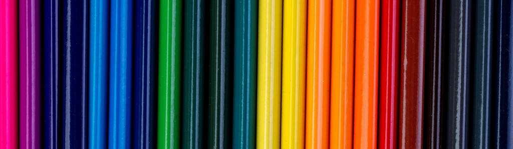
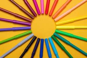
3. Colorful (but not too colorful) workplaces enhance productivity
It appears that a colorful room with good combinations and good design enhances the performance of the workers.
People tend to work better in a room with color than one lacking in it.

Indeed, culturally, we are used to the idea that a drab space is tied to boredom and lack of creativity. Color is stimulating.
4. White reduces performance

While many people prefer white in comparison with other neutral colors, it is usually seen as boring.
People tend to make more mistakes when working in a white environment.
The associations with white may vary, but just white is a bad idea for the workplace, as it reduces performance.
5. Colors can stimulate different types of performance
Another thing to consider is that different colors might have different effects on specific types of task.
It’s not the same thing having to focus on a series of equations or coming up with a new solution, as these tasks change the context.
It is possible to see that red stimulates thinking, while blue and green have a better effect on creativity.
6. A balance provides an optimal working environment
When the environment is saturated with a single color or one type of color (e.g., only neutral, cool, or warm colors), the effects might be counterproductive.
Too much red is annoying and distracting.

Too much blue might be too relaxing.
Too much white or gray makes the person less creative and changes the perception of the environment.
An environment that stimulates creativity and enhances performance has a good balance between cool and warm colors to get the best of both.
7. Lighting also matters

The perception of color in the office is not only influenced by the presence of the color, but also by its context. The lights can change the environment and contribute to productivity.
The lights that seem to work best to improve focus and well-being.
High correlated color temperature fluorescent lights seem to improve well-being in the office and contribute to higher productivity.
17000k, 3000k, and other similar lamps show the best results in a workplace environment.
Using bright and quality lamps can make a big difference in addition to the colors.
Color Psychology In The Workplace
Overall, the colors in a workplace do matter.
They can help reduce or improve productivity. If you have your doubts, picture yourself in a classic gray cubicle with no color, with gray as far as the eye can see.
It’s not an environment that favors creativity, both due to cultural factors (gray is often seen as the “boring” color) and to biological ones (gray creates low arousal).
Changing colors can make an impact in how well people perform, how well they think, how creative they are, and more.
Key principles for using color are to balance them and avoid over-saturating the environment with a single color.
If necessary, green seems to be one of the best colors to have around.
White, while neutral, has many drawbacks.
The goal is to choose the colors that best fit your office and your goals and understand that people will work best when the color scheme is right for the tasks they have to perform.
Elliot A. J. (2015). Color and psychological functioning: a review of theoretical and empirical work. Frontiers in psychology, 6, 368. https://doi.org/10.3389/fpsyg.2015.00368
Kurt, S., & Osueke, K. K. (2014). The Effects of Color on the Moods of College Students. SAGE Open. https://doi.org/10.1177/2158244014525423
Mills, P. R., Tomkins, S. C., & Schlangen, L. J. (2007). The effect of high correlated colour temperature office lighting on employee wellbeing and work performance. Journal of Circadian Rhythms, 5, Art. 2. DOI: http://doi.org/10.1186/1740-3391-5-2
Disclaimer: Our web pages and blog posts provide general information for general purposes only and not to be used for any medical, legal or alternative health advice for any type of physical, mental health or financial concerns.Always speak to your practitioner before embarking on any new alternative treatments. If you have concerns about any medical matters, you should always consult your healthcare provider without delay.We thank you for taking full responsibility for your own health and wellbeing in life. ☺